





Color Psychology in the Classroom: The Science Behind the New Generation of School Desk and Chair Hues
For decades, the typical school desk and chair was a study in institutional beige, grey, or fake woodgrain — colors chosen to hide dirt, not to stimulate minds. A new wave of design, informed by cognitive color psychology, is painting classrooms in warm, nuanced tones that boost focus, calm anxiety, and even improve mathematical reasoning.
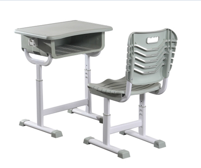
The visual environment of a classroom is a continuous, passive input into the developing brain. Neuroscientists have long understood that color temperature and saturation directly influence the autonomic nervous system. Overly bright, highly saturated primary colors (the "clown" palette of early childhood furniture) can overstimulate and fatigue the eyes. Conversely, the cold, institutional greys of secondary school furniture can induce listlessness and depression. A major American furniture brand has just released the "Spectrum" collection, a school desk and chair range developed in partnership with a university color cognition lab. The collection offers a curated set of scientifically tuned finishes: "Focus Green" (a muted sage that reduces cortisol while enhancing sustained attention), "Calm Blue" (a dusty periwinkle that lowers heart rate for independent reading), and "Warm Ochre" (a rich, earthy tone that promotes a sense of psychological safety and belonging). The desk tops are finished in a matte, glare-free "Cognitive White" that reflects the optimal spectrum of light for reading without sharp contrast strain.
The response from pilot schools has been remarkable. In a middle school in Oregon, a classroom furnished with the "Calm Blue" school desk and chair sets recorded a 40% drop in nurse visits for anxiety-related complaints compared to a control classroom with standard grey furniture. The explanation is not mystical; it's physiological. The specific blue wavelength, when processed by intrinsically photosensitive retinal ganglion cells, signals the brain's master clock to produce a state of quiet alertness, rather than the fight-or-flight response triggered by harsh, cool fluorescent lighting bouncing off shiny white surfaces. The school desk and chair thus becomes an extension of the lighting design, harmonizing the reflective environment. The manufacturer provides a specification guide that helps architects match wall paint, flooring, and furniture colors to create a coherent sensory ecosystem for each grade level, reflecting the developmental stage of the students.
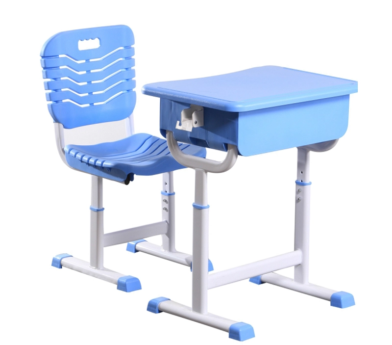
Beyond mood, the colors are being used to subconsciously guide behavior. The writing surface's "Cognitive White" includes a slight warm undertone that reduces visual stress for students with dyslexia and Irlen syndrome. The edges of the desk are banded in a subtly contrasting darker tone, providing a clear visual boundary that helps students with attention deficits organize their workspace. This represents a maturation of design thinking: the school desk and chair is no longer just a physical support, but a calibrated psychological tool. While the cost is comparable to premium standard finishes, the palette strategy requires a shift in district procurement from buying the cheapest available option to specifying a learning environment with the same precision given to a hospital or a cockpit. The question is shifting from "Is it cleanable?" to "How does it make a child feel, and how does that feeling support the lesson plan?"